A seamless, intuitive platform that help teams schedule meetings, delegate tasks, and collaborate more effectively.

Project Overview

Meetings are essential for team collaboration, yet scheduling them efficiently remains a challenge. Many professionals struggle with double bookings, unclear availability, and a lack of integration with their workflow tools. Meetlify is a meeting scheduling web app designed to solve these challenges by enabling teams to easily schedule, record, and manage meetings with seamless Google Calendar & Google Meet integration, real-time notifications, and automated transcriptions.

This case study walks through the end-to-end UX design process used to craft Meetlify’s user experience.

My Role

From the start of this project through its completion, I played the role of a Product Designer (UI/UX).

I was in charge of gathering information from stakeholders & potential users, researching, defining the information gathered, analysing data for design decisions, developing sketches, making designs, validating design decisions, prototyping, checking quality, etc.

The estimated period for this project’s completion was 2 weeks.

Problem Statement

Many teams face the following issues when scheduling meetings:

  • Difficulty in finding suitable time slots across different time zones.

  • No centralized meeting history or easy access to past meeting notes.

  • Lack of seamless integrations with commonly used work tools like Google Calendar and Zoom.

  • Tedious manual follow-ups after meetings, making collaboration inefficient.

The Goal

Our goal was to design an intuitive, user-friendly meeting scheduling platform that eliminates these pain points and improves productivity for teams.

My UX Design Process

Research

Here I will walk you through all the research methods involved in the project.

Analysis & Insight

This section focuses on all the insights gotten from analysing the results of the research.

Design & Prototyping

Here we created the wireframes and the prototypes of the mobile app.

Testing & Iteration

We then proceed to testing. We analysed users interaction by asking users to experience the app and give feedback using a survey.

The Research Phase

To understand the challenges users face when scheduling meetings, we conducted:

  1. User Surveys – Gathered insights from 10+ professionals, managers, and remote workers.

  2. User Interviews – Conducted 3 one-on-one interviews with team leads and project managers.

  3. Competitive Analysis – Analyzed existing tools like Calendly, Google Calendar, Trello, and Zoom to identify gaps.

Key Findings From Survey

  • 86% of users reported struggling with overlapping meetings.

  • 72% expressed frustration over scheduling across different time zones.

  • 65% wanted a feature to auto-generate meeting notes and transcripts.

  • Most users preferred a mobile-friendly experience for quick scheduling on the go.

Based on these insights, we defined our user personas and mapped their pain points.

Core Features & Functionality

  1. Smart Scheduling – Automatically detects best time slots based on availability.

  2. Calendar & Video Integration – Syncs with Google Calendar and Google Meet for smooth scheduling.

  3. Automated Meeting Notes & Transcriptions – Records discussions and generates meeting summaries.

  4. Time Zone Detection – Auto-adjusts time slots based on attendees’ locations.

  5. Recurring Meetings & Reminders – Allows easy scheduling of recurring sessions with reminders.

Responses and Feedback

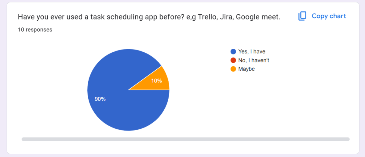
We asked responders if they had used a task scheduling app before to task management, and meeting scheduling. 90% of responders claimed that they were familiar with a task management app. This shows that people are familiar with these solutions.

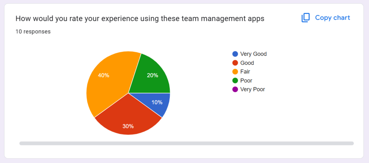
We asked users to rate there experience using a team management app and reports shows that users had a good experience with existing apps but there were still room for improvement

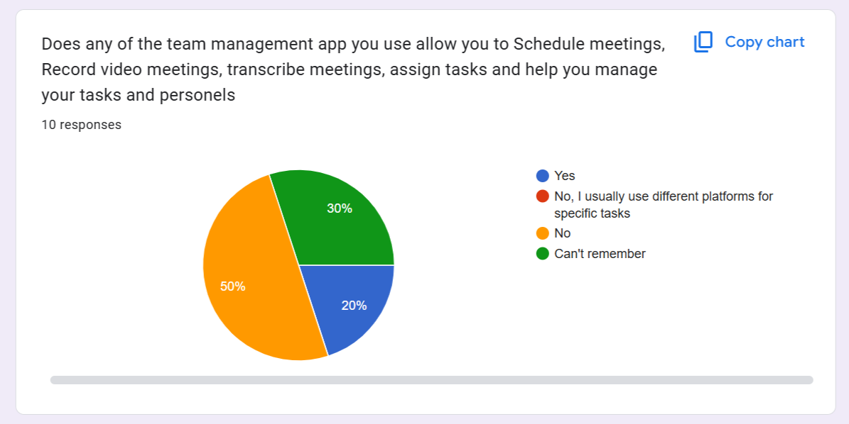
We asked if any of the tem management platforms they use allows them to Schedule meetings, Record video meetings, transcribe meetings, assign tasks, manage tasks and personels. 50% of responders said no, that they usally have to do from different platforms.

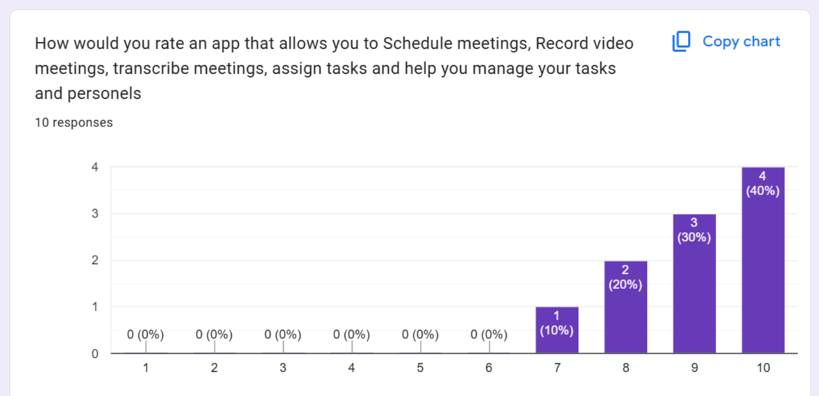
We wanted to know if an app that allows them to Schedule meetings, Record video meetings, transcribe meetings, assign tasks, and manage tasks was important to them. From the responses we got, we are positive it will be a useful solution.

User Pain Points

Needs

Users needs a platform that can help them manage their teams effectively.

Different Solutions

Users have to use different platforms to manage different tasks. Some of this platforms have a learning curve that can slow down productivity.

Charges

Users also complained about the exorbitant payment charges they get when using these management platforms.

User Interfaces

Users had challenges with complicated interface screens, complex/multiple features, or functions on one screen.

User Flow Map

Before jumping into the design, I created User Flow Diagrams to map how users navigate the platform.

Designing & Prototyping

Using low-fidelity wireframes, I mapped out the basic layout for:

  1. Dashboard – Quick access to upcoming meetings and scheduling tools.

  2. Meeting Scheduling Page – Users select participants, time slots, and video preferences.

  3. Meeting History Page – Provides past meeting recordings and notes.

Once approved, I moved to high-fidelity UI design using Figma, ensuring a clean, intuitive interface with a focus on:

  • Consistency in colors, typography, and spacing.

  • Accessibility (WCAG-compliant contrast & text sizes).

  • Minimal steps for meeting scheduling to reduce cognitive load.

Login Screen

Assigned Tasks

Scheduled Meetings

Usability Testing

I conducted 2 rounds of usability testing with 10 participants and gathered feedback on:

  • Ease of scheduling meetings

  • Clarity of meeting details and options

  • Intuitiveness of navigation

Key Improvements After Testing:

Reduced scheduling steps from 5 to 3 clicks.

Improved button placements for better accessibility.

Added color-coded meeting statuses for better visibility.

What I Learned

User feedback is invaluable: Iterating based on usability testing helped improve efficiency.

Simplicity wins: Reducing unnecessary steps made the experience smoother.

Accessibility matters: Ensuring text contrast and clear CTAs improved usability.

Final Thoughts

Meetlify is more than just a scheduling app—it’s a productivity tool designed to make meetings seamless and effective. Through an iterative UX process, I was able to create a solution that simplifies team collaboration.

What are your thoughts on this approach? I’d love to hear your feedback!